The best artwork for custom jewelry boxes is a simple, single-color vector logo, because foil stamping and debossing press your mark into the lid with a metal die. Customized Jewelry Boxes accepts any file you have, returns a free mockup within 24 hours, and lets you choose foil color and placement before you approve anything or pay.
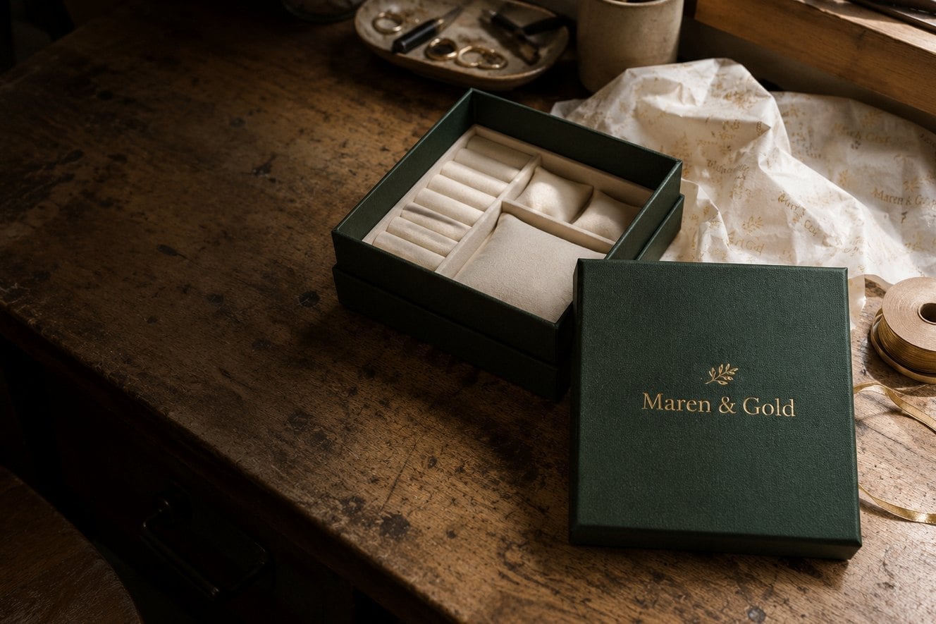
- Vector logo files (AI, EPS, SVG or vector PDF) stamp most cleanly.
- Foil is one color per impression; gold, silver and rose gold are popular choices.
- Free mockup within 24 hours with unlimited free revisions.
- Minimum order 12; standard turnaround about 2 weeks after approval.
What logo file works best for foil-stamped jewelry boxes?
A vector logo is the best file for foil-stamped jewelry boxes. Foil stamping and debossing both use a metal die cut from your artwork, so every edge in the file becomes an edge pressed into the lid. Vector formats such as AI, EPS, SVG or a vector PDF keep those edges crisp at any size, which is why Customized Jewelry Boxes asks for them first.
If you only have a JPG or PNG, send it anyway. Customized Jewelry Boxes can review a raster logo and tell you whether it will hold up as a die or needs to be redrawn as clean vector shapes before the mockup. Screenshots of a website header, logos pulled from social profiles and images saved from a phone are the most common files that need this extra step.
- Best: the original vector file from your designer or brand kit.
- Workable: a large, sharp PNG with a transparent background.
- Needs redrawing: small, blurry or heavily compressed images.
Whatever you send, the free mockup arrives within 24 hours, so you see how the file performs on the lid before you commit to anything.
Why does logo detail matter more on jewelry boxes than on printed packaging?
Logo detail matters more on jewelry boxes because foil and deboss press your mark into a small, textured surface instead of printing ink onto paper. Hairline strokes, tiny taglines and fine serifs can fill in, break up or disappear when a die meets a velvet, leatherette or textured paper wrap. A ring box lid offers far less room than a shipping carton, so every element has to earn its place.
Simple, bold marks almost always stamp best. A wordmark with even stroke weight, a monogram, or a single icon reads clearly on a ring box or earring box and still looks generous on a larger necklace box or jewelry set box. If your full logo includes a long tagline or a detailed illustration, consider a simplified version for the lid and save the full lockup for your website, cards and shipping inserts.
Elements that often need adjusting
- Taglines set in very small type under the main mark.
- Thin outlines around shapes or letters.
- Gradients, drop shadows and photographic effects, which foil cannot reproduce.
- Letters spaced so tightly that the gaps close up when stamped.

Which foil colors and finishes suit different jewelry box materials?
The right foil color for jewelry boxes depends on the contrast with the box surface. Gold foil on a dark or jewel-toned wrap, silver foil on black or navy, and rose gold on blush or white are the combinations buyers choose most often because the mark stays readable from across a counter. Blind deboss, which presses the logo without any foil, suits brands that want a quiet, tactile look on a single-color box.
| Box surface | Finishes that read well | Watch out for |
|---|---|---|
| Dark velvet or suede-touch | Gold or silver foil | Very fine lines softening in the pile |
| Leatherette | Gold, silver or rose gold foil, blind deboss | Deep grain hiding small text |
| Smooth paper or kraft wrap | Any metallic foil, colored foil, deboss | Low contrast on light kraft tones |
| Light or white wraps | Rose gold, gold or a dark colored foil | Silver foil looking washed out |
You do not need to decide alone. Ask Customized Jewelry Boxes to show two foil options side by side on the mockup, and compare them before you approve.
Where can the logo go on a custom jewelry box?
On most custom jewelry boxes the logo goes centered on the outside of the lid, because that is the first surface a customer sees when the box is handed over or unwrapped. The lid is also the flattest, most consistent area for a stamping die, which keeps the impression even from the first box to the last.
Depending on the style, other placements are possible. Some brands add a small mark to the inside lid lining or the insert, so the logo appears again when the box opens. Drawer-style and magnetic boxes may offer a front edge or a sleeve. Placement options vary by style, so the best approach is to tell Customized Jewelry Boxes which surfaces matter to you and let the mockup confirm what fits.
- Ring box: a compact mark centered on the lid.
- Earring box and bracelet box: centered lid mark with comfortable margins.
- Necklace box and jewelry set box: more room for a wordmark or monogram plus a short line.
- Travel jewelry case: a smaller, durable mark that stays legible after frequent handling.
If you order several box styles in one project, ask for one logo size that works across all of them so your packaging looks like a family.
How does the free mockup and proof process work?
The proof process for custom jewelry boxes starts when you send your logo, preferred box style and approximate quantity through the quote form. Customized Jewelry Boxes returns a free mockup within 24 hours showing your mark on the chosen box, with the foil color and placement you asked for. You pay nothing until you approve the design.
- Send artwork: upload the best file you have and name the box styles you are considering.
- Review the mockup: check spelling, logo proportions, foil color and position on the lid.
- Request changes: revisions are unlimited and free, so ask for a smaller mark, a different foil or a new placement.
- Approve: once you sign off, production begins and standard turnaround is about 2 weeks, with faster options through express shipping.
Treat the mockup as your final checkpoint. Anything you approve is what gets cut into the die, so share it with whoever owns your brand before you say yes.
What artwork mistakes slow down a jewelry box order?
The artwork mistakes that slow down jewelry box orders are almost always small and avoidable. Most delays come from low-resolution files, missing fonts, unclear foil instructions, or a late change of mind after approval. Catching these before you send your file keeps the project on the standard timeline of about 2 weeks.
- Sending a tiny web logo: a file pulled from a site header rarely has enough detail for a die.
- Leaving text as live fonts: outline or convert text in vector files so letters do not change on another computer.
- Asking for full color: foil is one color per impression, so plan a single-color version of your mark.
- Forgetting a brand-standards check: confirm the approved logo version with your team before the mockup, not after.
- Approving on a phone screen: view the mockup at full size so you can judge spacing and small lettering.
- Changing the design after approval: a new die means a new start, so finalize details at the proof stage.
If you are unsure whether your file has one of these problems, send it as it is. Customized Jewelry Boxes will flag issues in the mockup and suggest a fix rather than letting a weak file go to production.
Should every jewelry box style in an order use the same artwork?
Using the same artwork across every jewelry box style in an order is usually the smartest choice for a consistent brand look. A single, well-sized mark stamped in one foil color ties ring boxes, earring boxes, bracelet boxes and necklace boxes together on a display table or in a gift bag. Customers recognize the brand instantly, whatever piece they bought.
There are good reasons to vary the artwork, though. A boutique may use a monogram on small ring boxes and the full wordmark on larger jewelry set boxes. A bridal or corporate gift program might add an event name or date line to one run while keeping the standard logo on everyday stock. Each variation is planned at the mockup stage, and every style still starts at the minimum order of 12, so you can test a design on a small run before committing to larger quantities.
Tell Customized Jewelry Boxes which styles you are ordering and how you plan to use them, and the mockup will show whether one artwork works everywhere or whether a second version makes sense.
Frequently asked questions
Can I send a hand-drawn sketch for my jewelry boxes logo?
Yes, a hand-drawn sketch is a fine starting point for custom jewelry boxes. Photograph or scan it clearly and upload it with the quote form. Customized Jewelry Boxes can review the sketch and explain whether it needs to be redrawn as clean vector artwork before a stamping die is made, and the free mockup within 24 hours shows how the finished mark looks on the lid.
Do jewelry boxes support multi-color logos?
Foil-stamped jewelry boxes use one foil color per impression, so a multi-color logo usually needs a single-color version for the lid. Most brands already have a one-color mark in their brand kit. If yours does not, ask for help on the mockup, where the team can show how a simplified version reads in gold, silver or rose gold before you approve.
Will a very thin font stamp cleanly on jewelry boxes?
Very thin fonts can be risky on jewelry boxes because hairline strokes may soften in velvet or break up on textured wraps. A medium or bold weight usually stamps more reliably. Customized Jewelry Boxes can flag fragile lettering on the free mockup and suggest a slightly heavier weight or larger size so your brand name stays legible on every box.
How large should my logo be on a ring box lid?
Logo size on ring box lids is limited by the compact surface, so the mark should leave comfortable margins on all sides. A short wordmark, monogram or icon works best. Rather than guessing at measurements, request a mockup from Customized Jewelry Boxes, which places your logo at a proportion that suits the lid and lets you ask for adjustments with unlimited free revisions.
Can my jewelry boxes show a different name or date on separate runs?
Custom jewelry boxes can carry different text on separate runs, such as an event date for a bridal order alongside your standard logo for everyday stock. Each version needs its own approved mockup and die, and each run follows the minimum order of 12. Plan the variations together so all proofs are approved at once and production stays on schedule.
Should I convert fonts to outlines before sending jewelry box artwork?
Converting fonts to outlines is recommended before you send vector artwork for jewelry boxes. Outlined text locks the letter shapes so they cannot change if the font is missing on another computer. If you are not sure how to outline text, send the file anyway, and Customized Jewelry Boxes will check it and point out anything that needs fixing on the mockup.
Is blind deboss a good option for minimalist jewelry box branding?
Blind deboss suits minimalist jewelry box branding because it presses your logo into the surface without any foil, creating a subtle, tactile mark. The finish works best on leatherette and smooth paper wraps with simple, bold logos. Ask Customized Jewelry Boxes to show blind deboss next to a foil option on your mockup so you can compare both looks before deciding.
What should I check on a jewelry box mockup before approving?
Before approving a jewelry box mockup, check the spelling of every word, the logo version, the foil color, the placement on the lid and the box style and color. View the proof at full size rather than on a small phone screen. Customized Jewelry Boxes offers unlimited free revisions, and you pay nothing until the design is approved.
Can my designer send artwork for our jewelry boxes directly?
Your designer can send artwork for custom jewelry boxes directly, which often speeds things up because designers usually hold the original vector files. Include your designer on the quote request or forward the mockup to them for review. Customized Jewelry Boxes returns the first mockup within 24 hours, giving both of you time to request changes before approval.
Does a dark logo work on black jewelry boxes?
A dark logo on black jewelry boxes needs a contrasting foil to stay visible. Gold, silver or rose gold foil turns a dark mark into a bright metallic impression, while blind deboss gives a tone-on-tone look that relies on texture instead of color. The mockup from Customized Jewelry Boxes shows which option keeps your logo readable on the box you chose.
How do I keep logo placement consistent across jewelry box reorders?
Keeping placement consistent across jewelry box reorders is easiest when you reference your previously approved mockup. Save the final proof and mention it when you request a new quote, along with the box style and foil color. Customized Jewelry Boxes can match the earlier layout, so new stock looks identical to boxes already on your shelves or in customer hands.
Get a free mockup for your jewelry boxes
Send your logo or idea and the quantity you have in mind. Customized Jewelry Boxes returns a free mockup within 24 hours, you approve the design before anything is produced, and standard turnaround is about two weeks with faster options available. Get a custom quote.